

How to Decorate for Fall as a Color Lover
By: Kayla Blanton
It’s that time of year: when home decor Instagram debates the earliest possible moment to break out ornamental pumpkins, and PSL lovers passionately defend their favorite seasonal drink. Then there’s another, more whispered pressure that strikes right about now, which is to tuck away the bright colors of summer in favor of autumnal tones. If you’re a neutrals fan, this calls for celebration. But if you, like me, love color, there’s little appeal to brown-washing your home in the name of coziness.
So, how can we compromise?
It’s definitely tricky, but there are a few ways to keep the color in while also welcoming the warm, nature-inspired feelings that fall brings.
Go Darker, Deeper, and More Muted
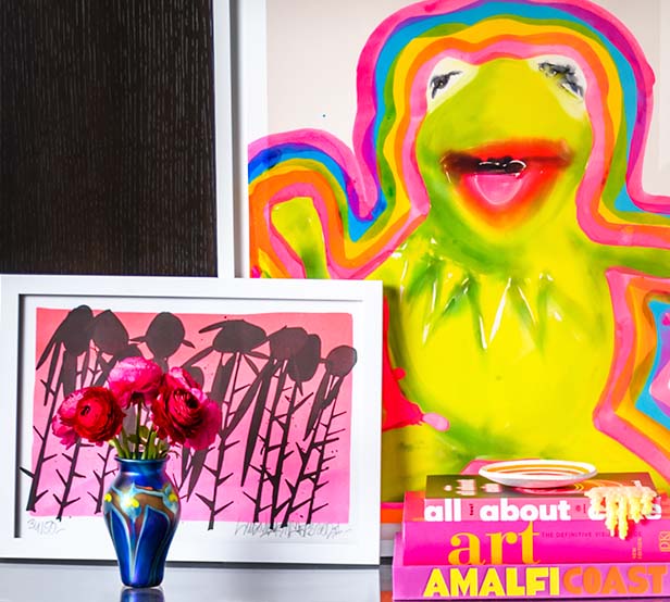
If you’re a color lover, you probably already have a few favorites that appear recurrently throughout your home. If they’re on the brighter side, consider implementing the same hue, but in a deeper or more muted shade—perhaps in the form of throw pillows, vases, blankets, and art.
“Holiday decor should be an extension of your existing color pallet,” says Karie Allen, the Oklahoma City-based designer behind Karie Allen Interiors on Instagram. She herself lives in a 100-year-old bungalow full of pinks, golds, blues, and greens.

Photo courtesy of Karie Allen
So, if your space, for example, is accented with chartreuse or bold violets, consider replacing them where you can with rich emeralds or sexy maroons. These swaps will easily shift the vibe and, at the same time, won’t have you reimagining your entire concept just for one season.
Play With Contrast
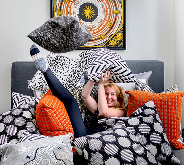
If you feel like bringing in the traditional warm oranges and greens, or even if you stick to your existing color palette, “Keep it interesting by using colors and patterns that can complement and contrast,” advises Allen. For example, on the color wheel, across from orange is blue (think deep navy or charcoal), and across from green is the red-pink family (think dusty mauves and vampire blood reds). Pairing those closely will make each one stand out.
Having trouble finding the colors you need? “I use a lot of spray paint to customize and incorporate black and white because it acts as a neutral!” Allen adds.
Incorporate Bold Pattern
Pattern is a perfect way to maintain visual interest in a space. Where you may be deepening and muting, color-wise, you can amp up the boldness with patterned textiles. This is also a great way to tie in new colors, and mix in neutral hues if you so wish.
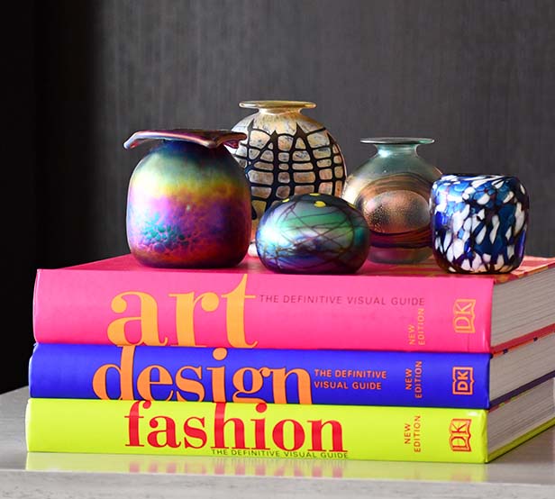
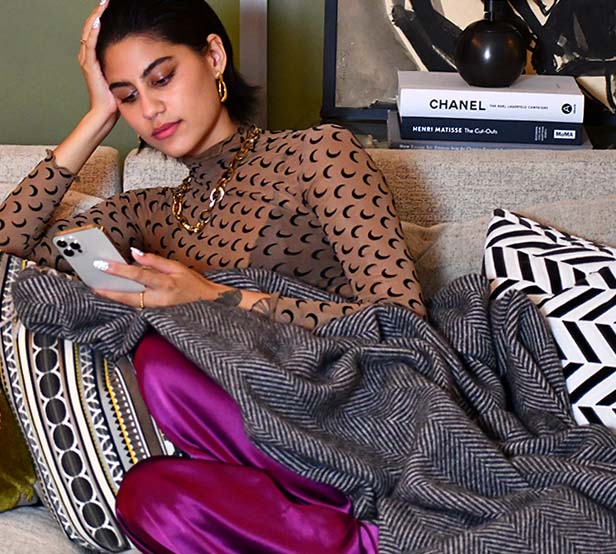
Try Jewel Tones
Jewel tones like gold, dark teal, and magentas are truly unsung fall heroes. They’re the unexpected, but fitting shades of the season, and you can use them in simple ways like brass candlesticks, velvet pillows, curtains, even candles.
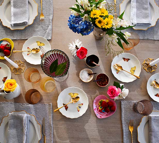
Make a Statement with Floral Arrangements
A fun way to keep color rotating through your space, even during fall, is to bring home the brightest flowers the supermarket has in stock. They inherently check off the nature-inspired seasonal decor box, and give you the creative freedom to arrange, mix, and match how you see fit. It’s a win-win.
Leave Your Color and Pay Attention to Lighting and Scents
A space doesn’t have to look like fall to feel like it. Ambiance is a powerful thing, and it can be achieved through candles, lamps, music, movies… it’s all connected! So, break out your warm scented candles, pick up a few thrifted lamps, and turn up the Carole King. Because let’s be honest, those elements scream fall louder than any plastic pumpkin I’ve ever seen.

Photo courtesy of Karie Allen
By Kayla Blanton: Jewel tones, brass, and amber glass make Kayla Blanton swoon. Those touches, plus lots of art, animal print, and road-trip gathered trinkets make up her 1920s Cape Cod in Cincinnati. You can read her work in Bustle, Prevention, Everyday Health, and more and follow her treasure hunting adventures @theweekendantiquer on Instagram.