Color Harmony 101
By: Angelica Frey
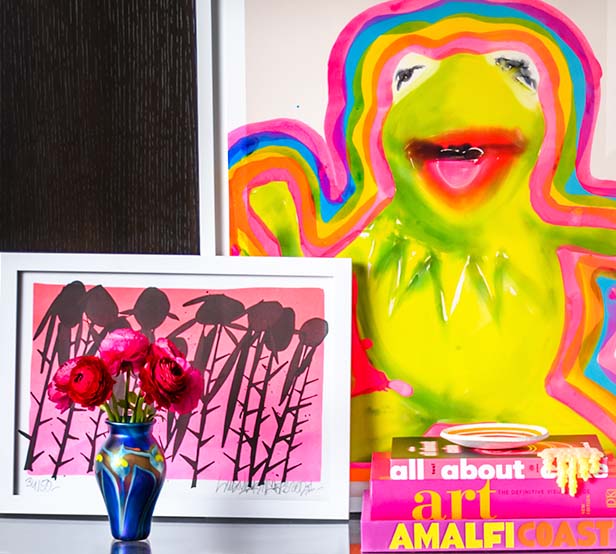
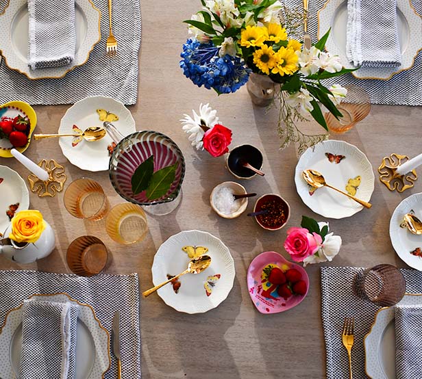
Designing and decorating your space starts with color. Unless you are a stark minimalist who only favors stark white, you are very unlikely to focus on one individual color. Rather, you will go for a color harmony. If you use makeup and are mindful in what you wear, you might be familiar with the concept. Without getting into the optics and science behind it, color harmony consists of combining hues in an aesthetically pleasing way
Sure, some color harmonies hinge on trends: the sixties favored bright, warm hues; the seventies warm, muted tones; the eighties saw both warm and cool bright tones, while the nineties, due to the influence of grunge, had a muted, yet cool color palette. In the last two decades, color fads have been cycling much faster, mainly thanks to the internet and user-driven trends.
If you favor neutrals, this little explainer will hopefully encourage you to incorporate some accents, if you’ve already fully embraced bright hues, this can give you further understanding as to why some work well together (knowledge is power, went one Game of Thrones adage).
To Start
Coloro, a color guide developed by Ascential, has a handy system that allows you to create harmonies. Each of the colors have a 7-digit code, the middle section indicates lightness whereas the end indicates chroma (saturation/brightness).
"Pick any hue and as long as the next color you choose has a similar lightness and chroma (saturation) level, the colors will be in unity," reads the explainer. Yet, unless you're a complete nerd, most of the time a good 'ole color wheel ($5 at Blick) will perfectly do.
Or, like me, you can procrastinate with the Adobe color palette (which beats scrolling social media in terms of idling).
Analogous: Corresponding Colors
Take your color wheel, and, whatever your favorite color is, just check what is to its left and what is to its right. It's a color harmony that you can easily find in nature. A scene from an autumn foliage has orange-red, yellow-orange, and rust-colored leaves. A sunrise has hints of warm, light pink, medium, neutral-toned pink, and lilac.
You usually see this color harmony in floral arrangements, and it's the least bold of the harmonies, but a good place to get started when harnessing the potential.
Complementary: Opposites Attract
A complementary color harmony is the opposite of an analogous color harmony. Pick one color, and check what's at the opposite end of the color wheel. Red and green, blue and orange, yellow and purple are famous pairs of complementary colors.
We get that relying on pairs of complementary colors to decorate your space might appear jarring, but there is a more accessible solution. Once you single out the shade that's complementary to your chosen color, look at the color wheel and consider both the shade to its right and the one to its left. So you think that red and green look too festive? You can pair red with turquoise and a lighter, warmer shade of green.
Triadic: The Power of Three
A triadic color harmony is composed of three colors that are evenly spaced on the color wheel.
You’ve been seeing triadic at play since early childhood. Think Superman and Wonderwoman whose outfits are primarily yellow, cyan and magenta. Then there’s the villains draped in purple, green and orange. In Disney's Sleeping Beauty, for instance, Maleficent wears purple, and a bright, acid green is the color of her magic orb. Triadic harmonies are not just for cartoons or kindergarten-room decor. You can easily upgrade the primary color palette by making it slightly darker and more muted: the yellow accent can go either marigold or mustard, the blue can be darker, the red less saturated, or you can go full-on pastel, with blush pink, sky blue and butter.
When playing with color harmonies, you're better off not keeping all colors in equal proportions. Home decor authorities recommend the 60-30-10 rule. 60 is the base color, 30 is the accent color, and 10 is the pop of color reserved for, say, pillows and accessories.
Now that you know the basics, it might make it less scary incorporating complementary and even triadic color accents into your home! Not sure where to start? Our bundles take the work out of what goes with what, and if you're even just curious to learn, it's a good browse-thru on how to match color through decor, accents and art.
By Angelica Frey: Angelica Frey’s aesthetic combines classicizes decadence with maximalist prints and a bold color palette. For the time being, though, her Brooklyn apartment is mostly white with yellow, turquoise, and pink accents. You can read her work in New York Magazine, The Guardian, WSJ, and ArtNews. She’s always looking for more designers and creatives to talk to @angelica_frey_writes

